Client project
Espaço Circular
A visual identity for a second-hand clothing store that brings reuse and support for charitable organizations into the same story.
This preview could not be loaded. You can still read the project.
Project details
- Client
- Espaço Circular
- Year
- 2026
- My role
- Brand strategy, visual identity, copywriting and social media content
- Scope
- Brand strategy · Branding & rebranding · Social media content
The brief
Espaço Circular is a second-hand clothing store with a charitable purpose: keeping clothes in use for longer while supporting charitable organizations, including cancer-support organizations.
The identity needed to connect the everyday act of choosing a pre-loved piece with the broader idea of circulation. The story centres on clothes as items with a continuing life, and on care that extends beyond a single purchase.
The direction
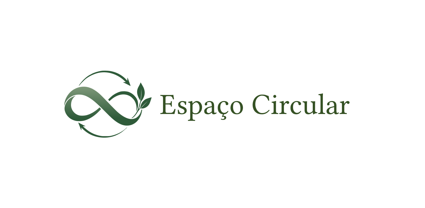
The symbol brings together an infinity loop, circular arrows and leaves. The arrows recall recycling, while the infinity shape expresses the possibility of clothes having a longer life through reuse. The leaves bring the environmental intention into the mark.
Deep green and sage lead the palette, supported by cream, dusty pink, terracotta and black. These quieter tones give the identity a warm, grounded character. The serif wordmark adds a more considered pace alongside the movement of the symbol.
The work
Bruna developed the branding, visual identity, copy, social media content and strategy. The selection presented here focuses on the logo system, colour palette and a presentation mockup.
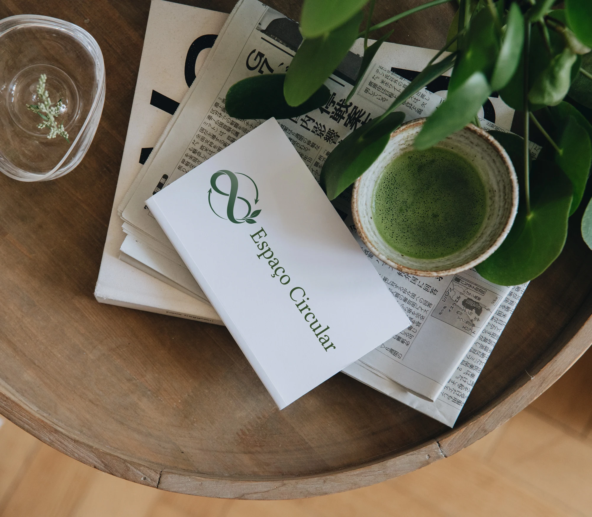
The standalone symbol and the horizontal lockup show how the same visual idea can work with or without the full Espaço Circular name. The mockup places the identity on a card in a setting of paper, wood and foliage, bringing the character of the brand into context.
This preview could not be loaded. You can still read the project.
Identity in context
Presentation mockup of the Espaço Circular identity on a card, surrounded by wood, paper and foliage. The setting echoes the natural references of the brand.
This preview could not be loaded. You can still read the project.
The name and the symbol
The horizontal signature pairs the circular symbol with the Espaço Circular name in serif lettering. The full name and mark form one recognisable signature.

This preview could not be loaded. You can still read the project.
A symbol for continued use
The infinity shape represents the longer life of clothes through reuse. Circular arrows recall recycling, and leaves express the environmental intention.

This preview could not be loaded. You can still read the project.
Earthy colour palette
The supplied palette, in order: #2F5B3A, #A7B89A, #F4EFE5, #D9A6A0, #C9846B and #000000. Greens lead the identity, with warm supporting tones.
Reflection
No measured results are reported for this project.
The connection between the visual identity and the store's purpose comes from a clear idea: something can keep circulating and remain valuable. The symbol carries that idea, while the restrained palette and serif lettering give it a welcoming, thoughtful tone.
Credits and production notes
- Bruna Kunrath — brand strategy, visual identity, copywriting and social media content
The card image is a presentation mockup. The gallery shows the supplied identity artwork and colour palette.
This preview could not be loaded. You can still read the project.
Espaço Circular
Identity in context
Presentation mockup of the Espaço Circular identity on a card, surrounded by wood, paper and foliage. The setting echoes the natural references of the brand.
View the complete projectThis preview could not be loaded. You can still read the project.
Espaço Circular
The name and the symbol
The horizontal signature pairs the circular symbol with the Espaço Circular name in serif lettering. The full name and mark form one recognisable signature.
View the complete projectThis preview could not be loaded. You can still read the project.
Espaço Circular
A symbol for continued use
The infinity shape represents the longer life of clothes through reuse. Circular arrows recall recycling, and leaves express the environmental intention.
View the complete projectThis preview could not be loaded. You can still read the project.
Espaço Circular
Earthy colour palette
The supplied palette, in order: #2F5B3A, #A7B89A, #F4EFE5, #D9A6A0, #C9846B and #000000. Greens lead the identity, with warm supporting tones.
View the complete project