Client project
Turuum
A playful identity and content direction for a gaming page about new releases, achievements, tips and the fun of exploring every corner of a game.
This preview could not be loaded. You can still read the project.
Project details
- Client
- Turuum
- Year
- 2026
- My role
- Brand strategy, visual identity, mascot design, copywriting and social media content
- Scope
- Brand strategy · Branding & rebranding · Social media content
The brief
Turuum is a gaming page built around news, new releases, achievements and practical tips. Its voice is informal: the kind of conversation you have with someone who also wants to find that last collectible or finally beat a difficult challenge.
The audience plan includes trophy hunters, explorers, completionists, casual players, competitive players and people who follow gaming news. The direction needed to make room for those different interests within one recognisable personality.
The direction
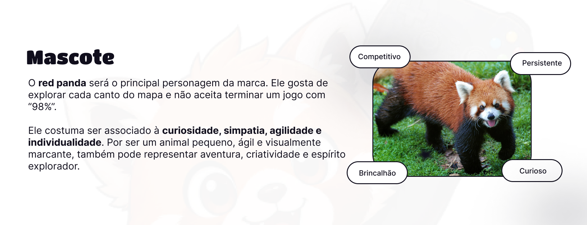
The red panda gives that personality a face. The mascot presentation describes a curious, playful, persistent and competitive character who explores every corner of the map and is not satisfied with leaving a game at 98%.
Rounded, heavyweight lettering and a warm palette keep the identity energetic and approachable. Peach and orange connect with the mascot, while a near-black tone gives the artwork definition. The typography study pairs the expressive forms of Modak and Titan One with Inter for supporting information.
The work
Bruna developed the branding, visual identity, mascot, copy, social media content and strategy. The identity composition combines the Turuum name, the red-panda character and a repeating mascot pattern. The accompanying studies explain the typography, audience profiles and character direction behind the artwork.
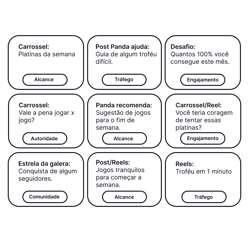
The content plan turns that personality into recurring ideas: weekly platinum trophies, help with a difficult achievement, game recommendations, community accomplishments and short tips. Carousels, posts and Reels are mapped to editorial goals such as reach, engagement, community and traffic. The planning sheet presents proposed formats and objectives.
This preview could not be loaded. You can still read the project.
A face for Turuum
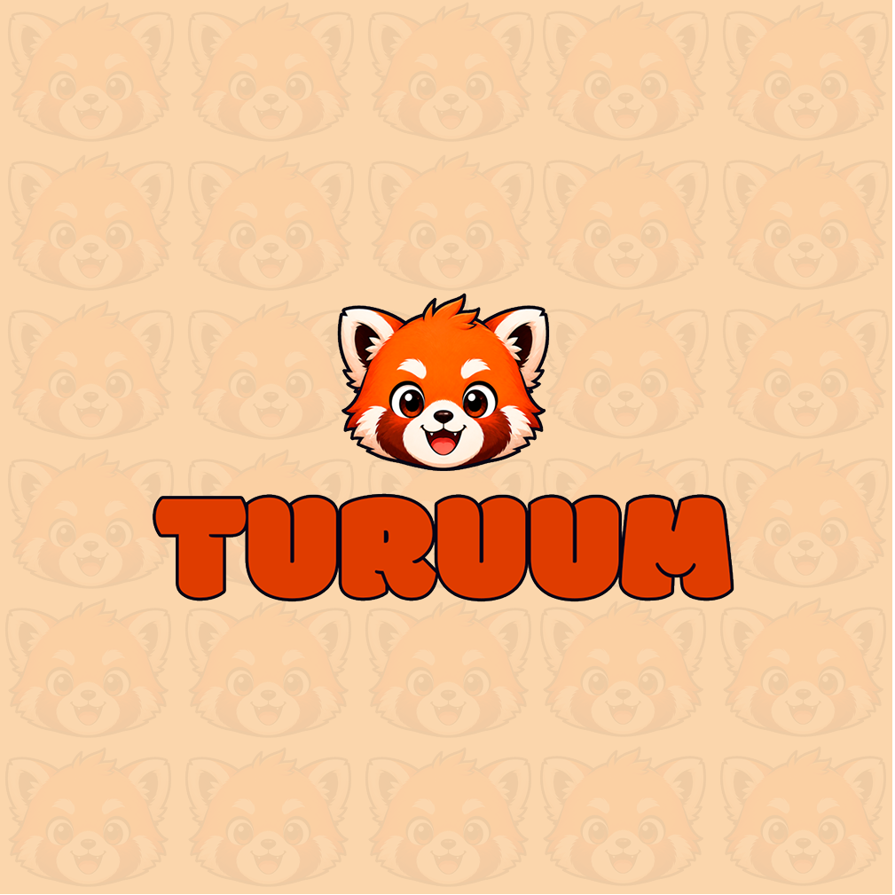
The red-panda mascot and rounded Turuum wordmark form the main identity composition. A repeating face pattern brings the character into the background as well.
This preview could not be loaded. You can still read the project.
The artwork is shown in its original language: Português.
The mascot's personality
The mascot is an explorer who wants to finish every corner of a game. Curiosity, friendliness, agility and individuality inform the character; playful, competitive and persistent traits connect it with the audience.
This preview could not be loaded. You can still read the project.
The artwork is shown in its original language: Português.
Type with a playful voice
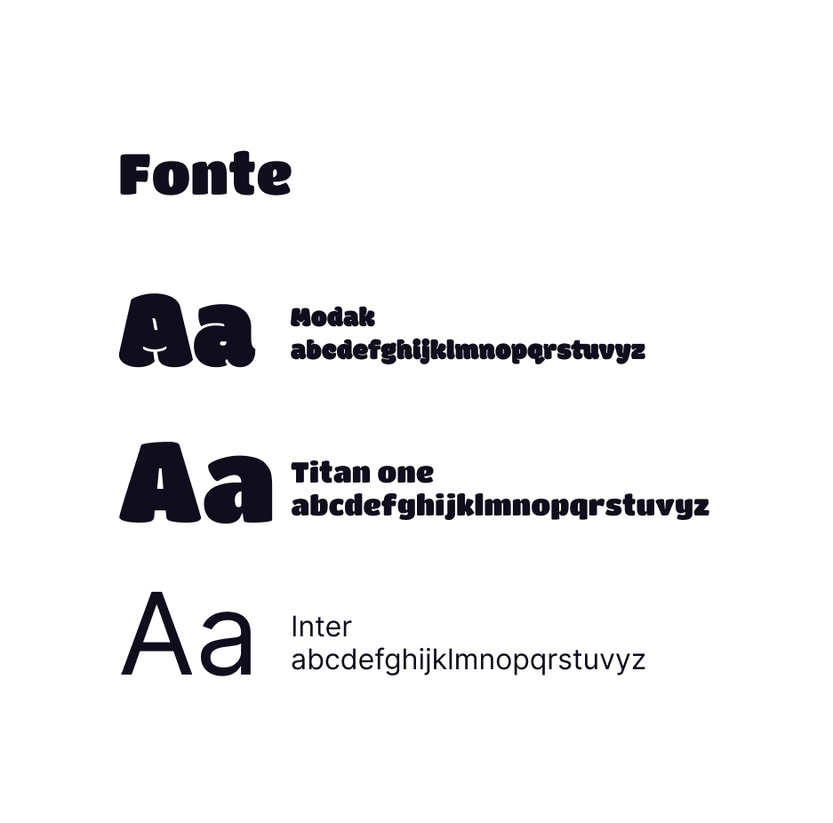
Modak and Titan One provide rounded, expressive display lettering. Inter supports longer information with a simpler reading rhythm. The original typography study shows all three side by side.

This preview could not be loaded. You can still read the project.
Warmth and contrast
The supplied palette, in order: #FFFFFF, #FBD6AC, #E67D43, #DF3C00 and #100E1C. Peach and orange echo the mascot, while the dark tone defines lettering and outlines.

This preview could not be loaded. You can still read the project.
The artwork is shown in its original language: Português.
Different ways to play
The audience plan spans trophy collection, secrets and collectibles, full completion, help with difficult missions, competitive improvement, and gaming news and trends. These profiles guide topic selection.
This preview could not be loaded. You can still read the project.
The artwork is shown in its original language: Português.
From personality to content
Ideas include weekly platinum trophies, difficult-achievement guides, completion challenges, game reviews and recommendations, community achievements, relaxed games and one-minute trophy tips. Reach, traffic, engagement, authority and community are planning objectives.
Reflection
No measured results are reported for this project.
Turuum's strongest thread is the connection between its character and its editorial voice. A curious mascot fits content about exploration; persistence fits achievement guides; and a playful tone gives recommendations and challenges a familiar, conversational feel.
The audience and content studies give that visual personality a practical role: helping organise the topics and formats the page can return to over time.
Credits and production notes
- Bruna Kunrath — brand strategy, visual identity, mascot design, copywriting and social media content
The gallery includes the supplied identity, mascot, typography, audience and content-planning artwork. The original presentation sheets remain in Portuguese.
This preview could not be loaded. You can still read the project.
Turuum
A face for Turuum
The red-panda mascot and rounded Turuum wordmark form the main identity composition. A repeating face pattern brings the character into the background as well.
View the complete projectThis preview could not be loaded. You can still read the project.
The artwork is shown in its original language: Português.
Turuum
The mascot's personality
The mascot is an explorer who wants to finish every corner of a game. Curiosity, friendliness, agility and individuality inform the character; playful, competitive and persistent traits connect it with the audience.
View the complete projectThis preview could not be loaded. You can still read the project.
The artwork is shown in its original language: Português.
Turuum
Type with a playful voice
Modak and Titan One provide rounded, expressive display lettering. Inter supports longer information with a simpler reading rhythm. The original typography study shows all three side by side.
View the complete projectThis preview could not be loaded. You can still read the project.
Turuum
Warmth and contrast
The supplied palette, in order: #FFFFFF, #FBD6AC, #E67D43, #DF3C00 and #100E1C. Peach and orange echo the mascot, while the dark tone defines lettering and outlines.
View the complete projectThis preview could not be loaded. You can still read the project.
The artwork is shown in its original language: Português.
Turuum
Different ways to play
The audience plan spans trophy collection, secrets and collectibles, full completion, help with difficult missions, competitive improvement, and gaming news and trends. These profiles guide topic selection.
View the complete projectThis preview could not be loaded. You can still read the project.
The artwork is shown in its original language: Português.
Turuum
From personality to content
Ideas include weekly platinum trophies, difficult-achievement guides, completion challenges, game reviews and recommendations, community achievements, relaxed games and one-minute trophy tips. Reach, traffic, engagement, authority and community are planning objectives.
View the complete project